

Why we moved our design tokens to OKLCH
HSL lies about lightness. OKLCH doesn't. What changed when we rebuilt a brand palette on a perceptually uniform color space.
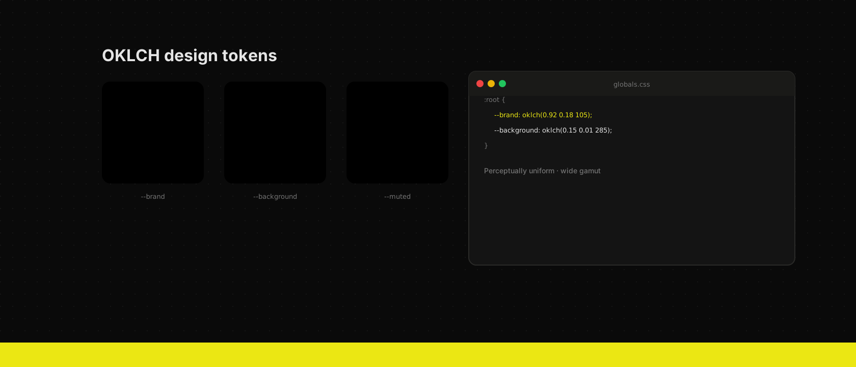
Pick a yellow and a blue with the same HSL lightness and put them side by side: the yellow glows, the blue sulks. HSL's "lightness" is a lie your design system tells you. OKLCH fixes that — its L actually corresponds to how bright a colour looks.
The practical wins
Derived shades keep their perceived weight. Hover states, muted variants and chart ramps can be generated by nudging one axis:
:root {
  --brand: oklch(0.902 0.1925 108.42);
  /* Same perceived lightness steps, one axis changed */
  --chart-1: oklch(0.902 0.1925 108.42);
  --chart-2: oklch(0.768 0.17 108.42);
  --chart-3: oklch(0.648 0.145 108.42);
}
And because OKLCH addresses colours outside sRGB, modern screens get the saturated P3 version of your brand colour while older ones clamp gracefully.
Gotchas
- Fallbacks are automatic in modern build chains — Lightning CSS
compiles
oklch()down tolab()/hex pairs for older browsers. - Don't eyeball chroma. Chroma limits differ per hue and lightness; validate that your combination is displayable instead of guessing.
- Keep tokens semantic. The space solves perception, not naming.
--brandbeats--yellow-500the day the brand changes.
We now define every colour in the system as OKLCH behind semantic tokens, and components never touch a raw value. One file to rebrand, zero visual surprises.
Want us to publish something specific?
Tell us what you'd like to read and we'll add it to our writing queue.
Get the next one in your inbox
New articles, videos and the occasional engineering note — a short mail when there’s something worth reading, nothing else.