

Leaving Radix for Base UI: a component migration story
When your primitive library changes direction, you migrate deliberately. Mapping Radix patterns onto Base UI, the accessibility differences that surprised us, and the codemod that did the boring three quarters.
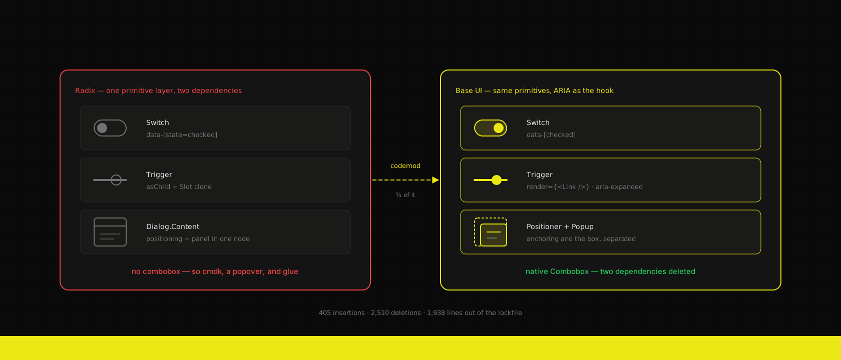
Every React codebase we ship has a layer nobody puts on the invoice: the twenty-odd unstyled primitives underneath the design system. Dialog, select, accordion, combobox, the popover that the mega menu is built on. For most of the last five years that layer was Radix, for us and for everyone else, because shadcn/ui made it the default and the default was good.
Then the ground moved. The people behind Radix, MUI and Floating UI converged on Base UI, shadcn's registry grew a Base UI style alongside the Radix one, and the question stopped being academic. We now run @base-ui/react across our shared component package and every new custom web application we start. This is what the move actually involved — not the announcement post, the diff.
Why we moved at all, given nothing was broken
Worth saying up front: Radix is not broken and your Radix app does not need rescuing. We didn't migrate because the old thing failed. We migrated because we maintain one component package across many client codebases, and a primitive layer is a twenty-year decision dressed up as a dependency. Three things decided it.
The maintenance signal — the same people, consolidated on one project, shipping regularly. The API convergence — Base UI's render prop and native-ARIA styling hooks are what Radix's asChild and data-state would look like if you designed them again knowing what everyone got wrong the first time. And the surface area — Base UI ships a real Combobox, which is the single component every business app needs and the one Radix never had, forcing everybody into cmdk plus a popover plus three hundred lines of glue.
That last one is not theoretical. Our own site carried exactly one Radix island for months: a searchable country picker on the contact and helpdesk forms, built from a shadcn registry pattern that vendored copies of Radix's popover, dialog, command and label into the repo. When Base UI 1.6 landed a native Combobox we deleted the island. The commit reads 405 insertions, 2,510 deletions — 499 lines of vendored primitives replaced by an 89-line generic component, radix-ui and cmdk gone from the manifest, and 1,938 lines out of the lockfile. Two dependencies fewer is two fewer things to audit on release-age and two fewer Renovate PRs a month.
The four patterns you rewrite
Ninety percent of a migration is the same four mechanical changes, over and over. Learn them once and the rest is typing.
asChild becomes render
Radix's asChild swapped in your element via a Slot that cloned the single child and merged props onto it. Base UI takes the element as a prop instead:
// Radix:  <Select.Icon asChild><ChevronDownIcon /></Select.Icon>
<SelectPrimitive.Icon
  render={<ChevronDownIcon className="size-4 text-muted-foreground" />}
/>
Same result, one real upgrade: render also accepts a function, (props, state) => ReactNode, so the rendered element can read the component's own state instead of you re-deriving it from a data attribute. And for your own components, useRender plus mergeProps gives you polymorphism without a Slot component in the tree at all:
function Badge({ className, variant = "default", render, ...props }:
  useRender.ComponentProps<"span"> & VariantProps<typeof badgeVariants>) {
  return useRender({
    defaultTagName: "span",
    props: mergeProps<"span">(
      { className: cn(badgeVariants({ variant }), className) },
      props
    ),
    render,
    state: { slot: "badge", variant },
  })
}
That badge renders as a span by default and as a Link when you pass one, with no wrapper and no asChild prop to document.
Content splits into Positioner and Popup
This is the change that costs the most time and the one no codemod will do for you. Radix's Content was one component doing two jobs: anchoring itself to the trigger, and being the visible panel. Base UI separates them — Positioner owns Floating UI and the anchoring props, Popup owns the box you style.
<SelectPrimitive.Portal>
  <SelectPrimitive.Positioner
    side={side} sideOffset={sideOffset} align={align}
    alignItemWithTrigger={alignItemWithTrigger}
    className="isolate z-50"
  >
    <SelectPrimitive.Popup data-slot="select-content" className={cn(…)}>
      <SelectPrimitive.List>{children}</SelectPrimitive.List>
    </SelectPrimitive.Popup>
  </SelectPrimitive.Positioner>
</SelectPrimitive.Portal>
In practice you rewrite every popover-shaped wrapper by hand and re-split its props: side, align, sideOffset go up to the positioner, everything visual stays on the popup. Budget an afternoon for the whole set. The payoff is that z-index and overflow finally live on a node that isn't also carrying your padding and shadow, which is why a stray z-50 on the panel stopped fixing anything.
data-state becomes the ARIA that was already there
Radix invented data-state="open" and you styled against it. Base UI's position is that if the accessible name for a state already exists in ARIA, that is the hook:
// Radix:      data-[state=open]:bg-muted
// Base UI:    aria-expanded:bg-muted
// Radix:      data-[state=checked]:bg-primary
// Base UI:    data-[checked]:bg-primary
Tailwind supports both shapes, so this is a find-and-replace — but do it attentively, because the mapping isn't uniform. Open/closed, disabled and selected map onto real ARIA attributes. States with no ARIA equivalent keep a data attribute, just a scoped one (data-checked, not data-state="checked").
Enter and exit animations move to CSS
Radix exit animations meant data-state="closed" keyframes, and if you wanted anything more you reached for forceMount and AnimatePresence. Base UI keeps the element mounted for the duration of its own transition and exposes the two boundary states:
<SheetPrimitive.Backdrop
  className={cn(
    "fixed inset-0 z-50 bg-black/10 transition-opacity duration-150",
    "data-starting-style:opacity-0 data-ending-style:opacity-0"
  )}
/>
One transition, two boundary states, no unmount race. This deleted a genuinely irritating class of bug for us — panels that flashed at 0.9 opacity on close because something re-rendered mid-exit.
The accessibility differences that surprised us
We expected a styling migration. We got an accessibility audit for free, which was not entirely comfortable.
Disabled controls stay focusable. Base UI leans on aria-disabled rather than the native disabled attribute on triggers. A natively disabled element is removed from the tab order entirely, which means a screen reader user tabbing a form never learns the control exists — they hit a silent gap. With aria-disabled the control is still reachable and still announced, it just doesn't activate. It's the better behaviour and it's why our accordion triggers style aria-disabled:pointer-events-none aria-disabled:opacity-50 rather than disabled:. It also means "disabled" no longer blocks pointer events for you; you opt into that in CSS, deliberately.
Missing ARIA now shows up as broken CSS. This was the uncomfortable one. Because the styling hook is the ARIA attribute, any trigger that wasn't correctly exposing its state to assistive technology also stopped getting its open-state styling. Two custom triggers in one client codebase went unstyled the moment we switched, and the reason was that they'd never been announcing aria-expanded at all. Under Radix they looked perfect and read as nothing. The design system now fails loudly instead of quietly — an accident of the API design that we've come to like a lot.
alignItemWithTrigger is on by default. Base UI's Select does the macOS thing: it positions the popup so the selected item sits over the trigger, rather than dropping below it. It's genuinely nicer for long lists and it looks wrong in a cramped sidebar or near a viewport edge. We expose it as a prop with the default kept, and turn it off per usage — worth deciding consciously rather than discovering in a client demo.
The codemod that did the boring part
Imports and the asChild rewrite are mechanical enough to automate, and there are enough call sites that you shouldn't do them by hand. ast-grep covers it without a jscodeshift setup:
id: as-child-to-render
language: tsx
rule:
  pattern: <$CMP asChild>$CHILD</$CMP>
fix: |-
  <$CMP render={$CHILD} />
# imports first, then the prop rewrite, then let Biome sort out formatting
ast-grep scan -r codemod/as-child-to-render.yml -U packages/ui apps/web
pnpm biome check --write .Be honest about what that leaves. The codemod handled our imports and asChild call sites cleanly. It cannot split Content into Positioner + Popup, it cannot know which data-[state=…] variant maps to ARIA and which to a scoped data attribute, and it will not catch state selectors hiding inside cva string literals — which is most of them in a Tailwind codebase. So the sweep afterwards matters more than the codemod:
rg 'data-\[state=|asChild|@radix-ui/' --type ts --type tsxRun that until it returns nothing, then run the app. Roughly: three quarters automated, one quarter by hand, and the quarter by hand is every popover wrapper you own.
What it cost, and what we'd tell a client
For our shared package — about twenty components, plus the app code consuming them — this was two focused days including the visual QA pass, and the diff came out smaller than it went in. The one-island purge on this site was an afternoon.
What we would not do is bill a client for migrating a stable, finished Radix app that nobody is actively extending. There's no user-visible outcome in it, and "the maintainers regrouped under a new name" is not a business case. The move earns its keep in exactly two places: a design system you maintain across multiple codebases, where the primitive layer is a long-lived asset; and any app that needs a real combobox, where you're otherwise about to add two dependencies and write glue that Base UI ships.
That's the same test we apply to every dependency decision — the OKLCH token rewrite passed it, plenty of shinier things haven't. Migrate the layer you'll still be maintaining in three years. Leave the finished app alone.
Want us to publish something specific?
Tell us what you'd like to read and we'll add it to our writing queue.
Get the next one in your inbox
New articles, videos and the occasional engineering note — a short mail when there’s something worth reading, nothing else.