

Mega menus that don't trap keyboards: accessible navigation at scale
Thirteen services across four groups need more than a hover dropdown. The roles a navigation menu must not use, what a portalled panel does to your tab order, and why the mobile menu is a different component rather than a smaller one.
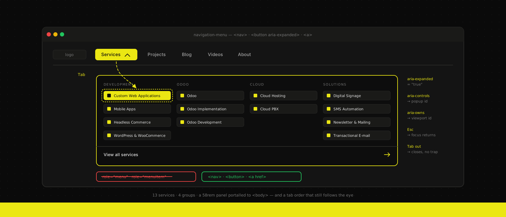
The header of this site opens a panel 58rem wide, four columns, thirteen services with an icon and a tagline each, and a "View all services" row underneath a separator. That is a mega menu, and a mega menu is what you build when the honest answer to "how many things go in the nav" is thirteen rather than five.
The trouble is that almost every mega menu on the web started life as a hover dropdown with five links, and the pattern that survives five links falls apart at thirteen. It falls apart quietly, too: it looks fine, it demos fine, and it's unusable for anyone driving the site with a keyboard, a screen reader or a thumb. This is what we had to get right in ours, and what we now check in every client build that grows a second row of navigation.
A mega menu is navigation, not a menu
Start here, because getting this wrong invalidates everything downstream. ARIA has a menu role. It is tempting — the thing is called a menu, the role is called menu, done.
It is the wrong role. role="menu" and role="menuitem" describe an application menu: the File/Edit/View bar in a desktop app, a right-click context menu, a set of commands. It carries an interaction contract with it. Screen readers switch out of the mode where arrow keys read the document and into one where arrow keys move between menu items. NVDA and JAWS announce "menu, thirteen items". Tab is expected to leave the whole menu, not step through it.
Now apply that to a list of links to pages. The user is told they've entered an application menu, arrow keys stop reading, and the announced item count is a promise about commands the component doesn't have. Everything they know about following a link stops applying.
Base UI, which our component package is built on since we moved off Radix, draws this line in the API itself — it ships two separate components and they emit different markup:
@base-ui/react/menu             → role="menu", role="menuitem", role="group"
@base-ui/react/navigation-menu  → <nav>, <button aria-expanded>, <a>
Grep the compiled navigation-menu output for role: and you will find exactly one hit, presentation, on the backdrop. There is no menu role in a navigation menu because site navigation is a <nav> landmark containing a button and some links, and that markup was already correct before ARIA existed. The first rule of ARIA use is still the right instinct here: don't use ARIA if a native element does the job.
So: pick the navigation component for navigation, the menu component for commands, and when you're hand-rolling, reach for <nav> and <a> and add nothing.
The trigger is a button, and /services still needs a link
The second decision people get wrong is making "Services" a link that also opens a panel. It cannot be both. A link navigates on activation; a disclosure toggles on activation. Wire both onto one element and keyboard users get whichever one you happened to prioritise, and screen readers announce a link whose actual behaviour is a toggle — a 4.1.2 Name, Role, Value failure with a real cost, not a theoretical one.
The trigger is a <button>, and Base UI's renders one by default, with the state exposed where assistive tech looks for it:
aria-expanded  → true while the panel is open
aria-controls  → the popup's id, while open
data-popup-open → present while open (the styling hook)
That leaves the actual question: people do want to reach the services overview page. The answer is that the link goes inside the panel, not on the trigger. Ours is the last row, after a separator, and it's a real <a href="/services">:
<NavigationMenuTrigger className={triggerBrandHover}>Services</NavigationMenuTrigger>
<NavigationMenuContent>
  <div className="grid w-[58rem] grid-cols-4 gap-6 p-4">
    {/* one column per service group */}
  </div>
  <Separator />
  <div className="p-2">
    <NavigationMenuLink render={<Link href="/services" />} className="justify-between …">
      View all services
      <ArrowRight />
    </NavigationMenuLink>
  </div>
</NavigationMenuContent>
Everyone reaches the overview the same way, by the same route, with the same number of key presses. Nobody has to guess whether clicking the top-level word will navigate or open.
Hover is a shortcut, not the interaction model
Hover is fine as an accelerator for people using a mouse. It is not an interaction model, for three separate reasons that each break a different group of users.
Touch has no hover. On a phone the first tap becomes a hover-emulating tap and the second one navigates, which is the origin of the "why did my link need two taps" bug. Ours never hits that path, because at that width we don't render this component at all — see below.
WCAG 1.4.13 has requirements about content that appears on hover. Additional content triggered by hover or focus must be dismissible without moving the pointer (Escape), hoverable — you can move the pointer onto the content without it vanishing under you — and persistent until dismissed or invalidated. The hoverable one is where naïve implementations die: a panel anchored below a trigger with a gap between them closes the moment the cursor crosses the gap. The library handles it with a safe-polygon pointer region plus a 50ms delay and closeDelay, and the positioner reserves a 10px pseudo-element bridge above the popup (data-[side=bottom]:before:top-[-10px]) so the cursor is never over dead space.
Nothing may depend on hover alone. Every path the pointer can take has to exist for the keyboard. On the trigger, ArrowDown opens the panel in a horizontal menu (ArrowRight in a vertical one), Enter and Space work because it's a button, and Escape closes it and returns focus to the trigger.
One detail worth stealing regardless of your library: the close event carries a reason. Base UI's is a union — triggerPress, triggerHover, outsidePress, listNavigation, focusOut, escapeKey, linkPress, none — so "why did the menu close" is a value you can branch on or log, rather than something you infer from a stack trace at 11pm.
Portalled panels and the tab order they quietly break
This is the part that surprises people, and it's the reason "we tested it with a mouse and it's fine" is not a test.
A mega menu panel is portalled to the end of <body>. It has to be — leave it inside the sticky header and it inherits that stacking context, gets clipped by overflow, and can't escape a container it's wider than. But the DOM is the tab order. Portal the panel to the end of the document and tabbing off the "Services" trigger lands you on the Blog link, past a panel that is visually right underneath the thing you just focused. Focus order stops matching the visual order, which is 2.4.3 Focus Order failing, and there is no way for a keyboard user to reach thirteen of your links.
The fix is not to un-portal. It's to re-link the two positions, and the mechanism is a visually-hidden span next to the trigger owning the viewport, plus focus sentinels either side of it:
// what the trigger renders while its panel is open
<FocusGuard onFocus={/* pull focus back into the popup */} />
<span aria-owns={viewportElement?.id} style={ownerVisuallyHidden} />
<FocusGuard onFocus={/* hand focus to the next tabbable after the trigger */} />
aria-owns tells assistive technology that the portalled panel belongs here, immediately after the trigger, regardless of where it sits in the DOM. The guards do the same job for sighted keyboard users: tab off the trigger and you land on the first link in the panel; tab past the last one and you land on whatever follows the trigger in the header — and the menu closes with reason focusOut, because tabbing out of a navigation menu should close it.
Which brings up the thing people reach for and shouldn't: do not focus-trap a mega menu. A trap is right for a modal dialog, where the rest of the page is genuinely unavailable. A navigation panel is not modal. Trapping focus in it means a keyboard user who opened it by accident can only escape by knowing to press Escape — and 2.1.2 No Keyboard Trap says Tab alone must be enough to get out. Close on focus-out; never trap.
While you're in there, check 2.4.11 Focus Not Obscured too. A sticky header is a hazard for every focused element that scrolls under it, not just the ones in the menu. Ours sits at z-40 and the menu positioner at z-50, so the panel is over the header rather than under it.
Focus has to be as loud as hover
The cheapest accessibility failure in a mega menu is a beautiful hover state and a focus state you forgot. Thirteen items with a strong hover treatment and a default browser outline is a menu where keyboard users can't tell where they are.
We solve it by making it impossible to write one without the other. There's a single exported constant, and it carries both:
/** One hover language everywhere: the brand-yellow wash. */
export const brandHover =
  "hover:bg-brand hover:text-brand-foreground focus:bg-brand focus:text-brand-foreground"
Every nav item takes brandHover; the trigger takes that plus the data-popup-open and data-open variants so it stays washed while its panel is open. The keyboard user sees exactly what the mouse user sees, because it is the same declaration. And the wash is --brand at oklch(0.902 0.1925 108.42) with --brand-foreground near-black — a bright yellow carrying dark text, which clears contrast comfortably in both themes. Yellow on white text would not, and a hover style that fails contrast is a hover style that fails contrast for everybody. Our tokens are defined once in OKLCH precisely so this is checkable rather than a vibe.
Keep focus-visible for the ring. Focus styling should be visible on keyboard focus; a full ring on every mouse click is noise, and noise is what leads teams to delete the ring entirely.
The mobile menu is a different component, not a smaller one
The instinct is to make the 58rem grid responsive down to 375px. Don't. A four-column grid of icon-plus-tagline cards at phone width is either unreadably small or a wall of scroll, and the interaction — hover-open panels — has no meaning on touch.
So the header renders MainNav at md: and up, and MobileNav below it: a Sheet with an Accordion inside, one row per service, tap to expand, tap to navigate, sheet closes. Different component, different interaction, correct for its input device.
What makes that safe rather than a maintenance trap is that both read the same array:
/**
 * Single source of truth for the service catalogue.
 * Drives the mega menu, footer, services pages, homepage grid and sitemap.
 */
export const serviceGroups: ServiceGroup[] = [ /* Development, Odoo, Cloud, Solutions */ ]
Two navigations that disagree about what the company sells is not a content bug, it's an accessibility bug — the mobile user and the desktop user are being offered different sites. One typed array, five consumers, and adding a service is one object literal.
Two things to check on the touch side specifically. 2.5.8 Target Size (Minimum) wants 24×24 CSS pixels; a py-2 text-sm row clears that with room, but a dense list of text links with no vertical padding does not. And the sheet needs overflow-y-auto with real bounds — thirteen services plus four page links plus two buttons is taller than a phone in landscape, and content you can't scroll to is content that isn't there.
Two defaults worth changing
Two Base UI defaults are worth a deliberate decision rather than an accident, and both are one prop.
NavigationMenu.Link has closeOnClick defaulting to false. With a full page load that's invisible — the document is replaced anyway. With a client-side router it isn't: the route changes underneath a panel that is still open, sitting over the page the user just asked for. If your links are Next.js <Link>s, that default is wrong for you.
active is the second. Passing it emits aria-current on the link and a data-active attribute you can style. A visitor already on /services/odoo-implementation should be told so when they open the menu, and screen reader users get that from aria-current or not at all.
<NavigationMenuLink
  closeOnClick
  active={pathname === serviceHref(service)}
  render={<Link href={serviceHref(service)} />}
/>
The test that keeps it honest
Every fix above is one careless refactor away from regressing, and none of it shows up in a visual snapshot — a screenshot of a closed menu looks identical whether or not the panel is reachable. So the contract goes in a spec:
test("the services panel is reachable and escapable by keyboard", async ({ page }) => {
  await page.goto("/")
  const trigger = page.getByRole("button", { name: "Services" })

  await trigger.focus()
  await expect(trigger).toHaveAttribute("aria-expanded", "false")

  await page.keyboard.press("ArrowDown")
  await expect(trigger).toHaveAttribute("aria-expanded", "true")

  // tab order follows the visual order, despite the portal
  await page.keyboard.press("Tab")
  await expect(page.getByRole("link", { name: /custom web applications/i })).toBeFocused()

  // escape closes and gives focus back — no trap
  await page.keyboard.press("Escape")
  await expect(trigger).toBeFocused()
  await expect(trigger).toHaveAttribute("aria-expanded", "false")
})
Four assertions, and between them they cover the disclosure contract, the portal fix, the escape hatch and focus return. Add one that tabs past the last link and asserts the panel closed, and you've covered the trap.
Automated axe checks are worth running as well, but be clear about what they buy you: axe finds contrast failures, missing names and bad roles on the rendered DOM. It cannot tell you that Tab from the trigger skips thirteen links, because a portalled panel with perfect markup passes every rule. The keyboard test is the one that catches the bug that actually ships.
What we actually do
Navigation component for navigation, never role="menu". Button as the trigger, overview link inside the panel. Hover as an accelerator on top of a keyboard path that works on its own. Portal the panel and re-link it with aria-owns and focus guards rather than trapping focus in it. One class that styles hover and focus together, so neither can be forgotten. A separate component for touch, reading the same typed array as the desktop one. And a keyboard spec, because that is the only part of this a screenshot won't check.
None of it is expensive if you decide it before the nav has thirteen items in it. Retrofitting it onto a hover dropdown that's been growing for three years costs considerably more — which is the argument we make on every custom web application that is about to gain a second row of navigation, usually about a year before anyone was planning to think about it.
Want us to publish something specific?
Tell us what you'd like to read and we'll add it to our writing queue.
Get the next one in your inbox
New articles, videos and the occasional engineering note — a short mail when there’s something worth reading, nothing else.