

Design tokens in Tailwind v4: one palette, every surface
CSS-first config turns Tailwind into a token pipeline: OKLCH variables in, consistent components out. The two-layer setup, the one keyword that makes dark mode work, and the four files where the cascade stops.
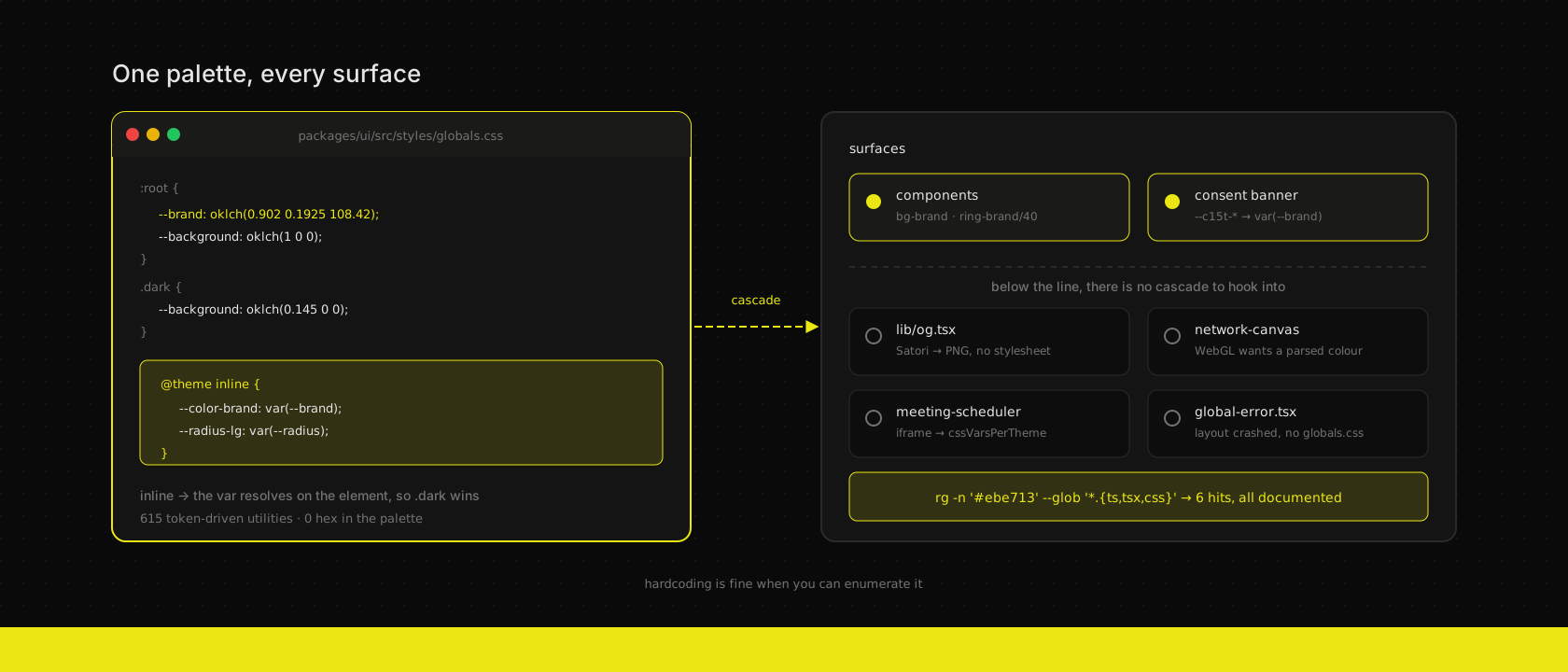
Our brand yellow is one value. Counting the places it has to come out right: every button and focus ring on this site, the consent banner from a library we didn't write, the OG image rendered server-side into a PNG, a WebGL globe on the homepage, a Cal.com booking widget in an iframe, the error page that renders when the root layout itself has crashed, and — for most clients — an invoice PDF printed by an ERP that has never heard of our CSS.
Seven renderers. One value. The naive answer is to paste #ebe713 into seven files and move on, and the bill for that arrives on the day someone changes it. The better answer is a token pipeline where the cascade covers as much as it possibly can, and every place it can't reach is a deliberate, greppable exception. Tailwind v4's CSS-first config is what finally made that pipeline short enough to be worth writing down.
This is our setup, from the file that owns the palette outwards. We use the same shape on every custom web application we ship.
Two layers in one file
There's no tailwind.config.ts anymore. The theme is CSS, and in our monorepo it lives in the shared component package — packages/ui/src/styles/globals.css — which both the site and every app that imports @workspace/ui pull in.
That file has two distinct layers, and keeping them distinct is the entire design.
The bottom layer is the raw palette: plain custom properties on :root, overridden on .dark. Values only, no Tailwind involvement:
:root {
  /* Brand yellow — identical in both themes (#ebe713) */
  --brand: oklch(0.902 0.1925 108.42);
  --brand-foreground: oklch(0.145 0 0);
  --background: oklch(1 0 0);
  --foreground: oklch(0.145 0 0);
  --primary: oklch(0.145 0 0);
  --primary-foreground: oklch(0.902 0.1925 108.42);
  --ring: oklch(0.65 0.14 108.42);
}

.dark {
  --brand: oklch(0.902 0.1925 108.42);
  --background: oklch(0.145 0 0);
  --foreground: oklch(0.985 0 0);
  --primary: oklch(0.902 0.1925 108.42);
  --primary-foreground: oklch(0.145 0 0);
  --ring: oklch(0.902 0.1925 108.42);
}
Note what the brand does and doesn't do across themes. --brand is the same in both — it's the logo colour, it doesn't get to drift. --primary inverts: near-black on white, yellow on black. Two different jobs, two different tokens, which is why "just use the brand colour for primary" falls over the first time someone builds a light-mode button. Everything is OKLCH, so derived shades — the chart ramp, hover states — stay perceptually even when you nudge one axis.
The top layer is the bridge into Tailwind's namespace, and it's the only place Tailwind is mentioned at all:
@import "tailwindcss";
@custom-variant dark (&:is(.dark *));

@theme inline {
  --color-brand: var(--brand);
  --color-background: var(--background);
  --color-foreground: var(--foreground);
  --color-primary: var(--primary);
  --color-ring: var(--ring);
  --radius-lg: var(--radius);
  --radius-sm: calc(var(--radius) * 0.6);
  --font-heading: var(--font-display, var(--font-sans));
}
--color-brand existing is what makes bg-brand, text-brand, ring-brand/40 and from-brand real utilities. Same for --radius-* and rounded-lg, and for --font-heading and font-heading. You never write a colour in a component; you write a utility, and the utility resolves through the bridge to a value you can change in one place.
Across this site and the shared package that's 615 token-driven utility usages. The literal string #ebe713 appears in the stylesheet exactly once — in the comment above, explaining what the OKLCH triplet is.
inline is not a formatting preference
That keyword on @theme inline is the part people paste without reading, and it's the part that decides whether dark mode works.
Without it, Tailwind treats your theme variables as its own and emits them into :root, then points utilities at those:
/* @theme (no inline) */
:root { --color-background: var(--background); }
.bg-background { background-color: var(--color-background); }
Looks fine. It isn't. Custom properties are substituted at computed-value time on the element where they're declared — here, :root. So --color-background inherits down the tree already flattened to the light value. A .dark further down re-declares --background, but nothing re-reads it, and your dark mode silently does nothing.
With inline, Tailwind substitutes the value straight into the utility instead:
/* @theme inline */
.bg-background { background-color: var(--background); }
Now the lookup happens on the element that carries the class, inside whatever .dark scope it lives in, and the override lands. One keyword, and the difference between a theme toggle and a bug report titled "dark mode doesn't work on cards".
The corollary: inline means the theme variables no longer show up in :root on their own. Anything reading them from JavaScript reads the bottom layer — --brand, not --color-brand.
The monorepo bit nobody warns you about
Tailwind v4 finds your classes by scanning from the CSS file's location, skipping anything .gitignored and anything in node_modules. In a pnpm workspace, @workspace/ui is in node_modules from the app's perspective — a symlink to packages/ui. So the shared components whose classes you actually want are, by the default heuristic, exactly the ones not scanned.
You get a build with no errors and no styles, which is a bad twenty minutes. Three lines fix it:
@source "../../../apps/**/*.{ts,tsx}";
@source "../../../components/**/*.{ts,tsx}";
@source "../**/*.{ts,tsx}";
Paths are relative to the CSS file. Declaring them here rather than in each app means a new app in the monorepo inherits the correct scanning by importing one stylesheet, which is the whole point of putting the theme in a package.
Surface two: theming something you didn't write
Consent banners are the honest test of a token system, because you don't own the markup. Ours is c15t, which themes itself from a small set of --c15t-* variables — so the integration is variable-to-variable and no component gets forked:
:root:root:root,
:root:root:root .c15t-theme-root {
  --c15t-primary: var(--brand);
  --c15t-primary-hover: color-mix(in oklab, var(--brand) 85%, var(--foreground));
  --c15t-surface: var(--card);
  --c15t-text: var(--card-foreground);
  --c15t-border: var(--border);
  --c15t-overlay: color-mix(in oklab, var(--foreground) 15%, transparent);
  --c15t-radius-lg: var(--radius);
}
color-mix deserves a mention: the hover state is derived, not chosen. Change the brand and the hover follows it, in oklab, without anyone opening a colour picker.
The tripled :root:root:root is not a typo and it cost us a real afternoon. The banner was correctly branded in dark mode and stubbornly grey in light mode. The library injects its defaults twice — once as :root declarations, and once at element level on .c15t-theme-root. A single :root ties on specificity with the first and loses source order; and an element-level custom property beats an inherited one outright no matter how specific your ancestor selector is. So you need both: repeat the selector to outrank the runtime :root block, and target the element itself to outrank the element-level one.
The rule we took away: when a third-party widget "ignores your theme", check whether it's declaring the variable on the element rather than the root before you start writing !important. That comment now sits above the block in the stylesheet, because the next person to touch it will otherwise delete two thirds of it as redundant.
Surface three: where the cascade doesn't go
A token system earns trust by being honest about its edges. There are renderers where no amount of CSS-first config helps, because there is no cascade to hook into. In this codebase the brand hex is hardcoded in exactly four files, and every one of them has a reason:
| File | Why the token can't reach |
|---|---|
lib/og.tsx | OG images render through Satori into a PNG on the server. Inline style objects, no stylesheet, no custom properties. |
components/scenes/network-canvas.tsx | The globe is WebGL. Three.js wants a colour it can parse into a material, not a var(). |
components/meeting-scheduler.tsx | The Cal.com booking widget is a cross-origin iframe. Its theme crosses the boundary as an API argument — cssVarsPerTheme — not as inherited CSS. |
app/global-error.tsx | It replaces the root layout when the root layout has crashed. No globals.css, no fonts, no components. Inline styles are the only thing guaranteed to render. |
Static assets are the fifth category: every cover image in public/covers/ is an SVG with #0a0a0a and #ebe713 written into it, because it's a file on disk, not a component.
We're not precious about this. Hardcoding is fine when the alternative is a worse abstraction — what's not fine is hardcoding you can't enumerate. The test is a single command, and it's the one we run before saying a palette change is done:
rg -n '#ebe713' --glob '*.{ts,tsx,css}'Six hits: five in application code across those four files, each with a comment explaining itself, and one in the stylesheet that is a comment. If that number ever climbs, someone has started styling by hand and the pipeline has quietly stopped being the source of truth.
The surface most agencies forget: the ERP prints too
For clients on Odoo, the brand shows up in a place the front-end team never looks — the quote, the invoice, the delivery note. Those are rendered by QWeb into PDF, server-side, by a system that will never see your Tailwind build. You cannot share variables with it, so you do the next best thing: keep one written definition of the palette that both pipelines are implementations of, and treat the QWeb report templates as a first-class surface in the design system rather than something the Odoo team improvises at the end of the project.
The failure mode here is depressingly common and instantly visible to the customer: a website in the new brand, a PDF still in the old one, arriving in the same inbox.
What it's actually worth
The payoff isn't aesthetic, it's the cost of the next change. A rebrand on this setup is a diff in the :root and .dark blocks, a pass over four documented exception files, one regeneration of the static SVGs, and whatever the ERP templates need. It's an afternoon with a checklist — not an archaeology project across a codebase where the hex is in sixty places and nine of them are subtly a different yellow.
That's the same argument we make about every layer worth centralising: put the decision in one place, make the places that can't participate visible, and never let "it's just a colour" become forty files. The OKLCH move gave us a palette that derives cleanly. Tailwind v4's CSS-first config is what got that palette to every surface that will accept it — and a short, honest list of the ones that won't.
Want us to publish something specific?
Tell us what you'd like to read and we'll add it to our writing queue.
Get the next one in your inbox
New articles, videos and the occasional engineering note — a short mail when there’s something worth reading, nothing else.